The things you only discover after opening the parcel
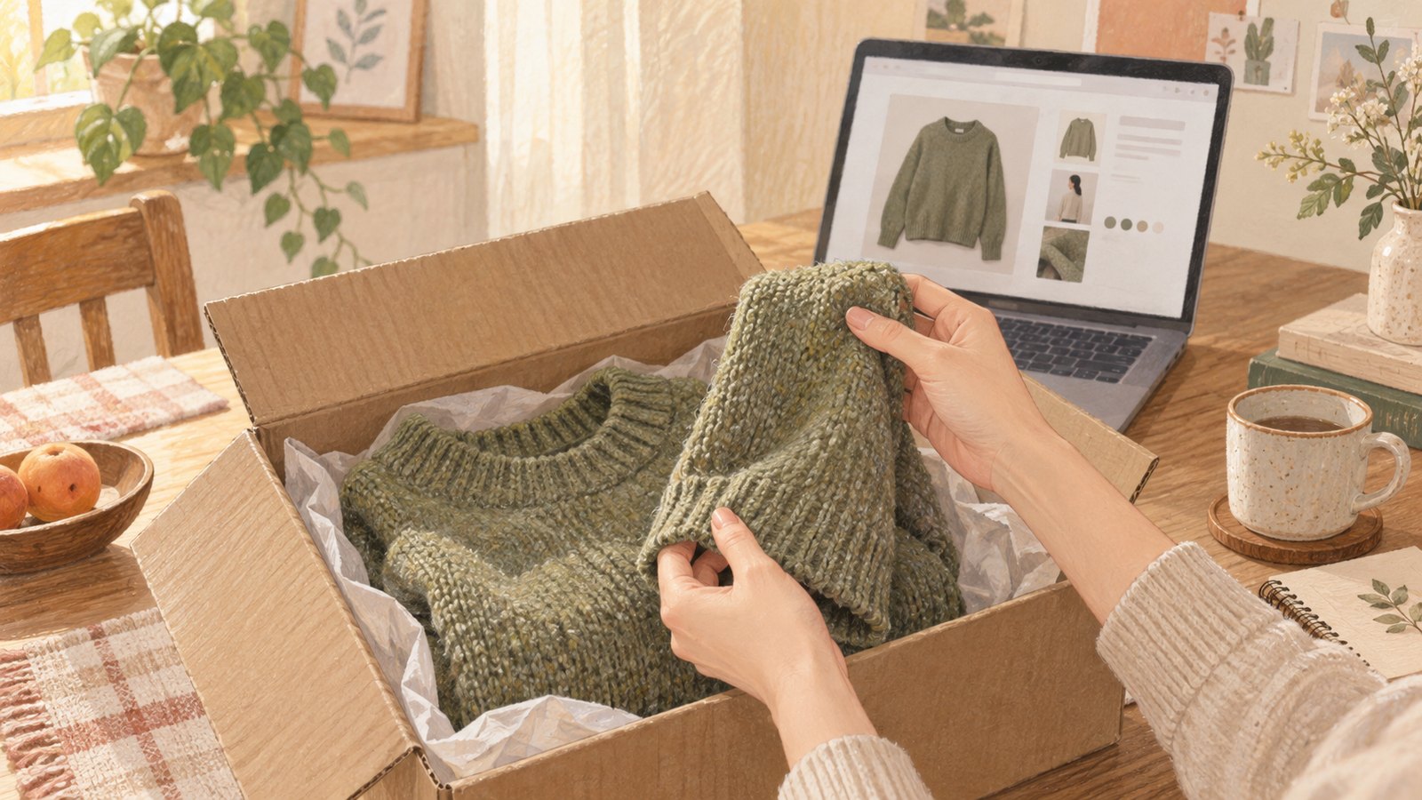
I buy clothes online often. Comparing styles and prices in one place and having an order arrive at the door is genuinely convenient. But I have also opened plenty of parcels and realized that the garment in my hands was not quite the one I had pictured on screen.
A knit that looked soft felt surprisingly prickly. A muted color appeared much brighter in real light. Fabric that seemed fluid stood away from the body, or static and pilling showed up only after wearing it. The product page was not necessarily wrong; some information simply does not travel well through a photograph and a few short lines of copy.
That gap was the starting point for MANJEOBOM. It cannot solve every mismatch, but it can make the clues already present on a clothing label easier to use—especially for questions about feel, wear, and care.
The information was there, but the language of feel was missing
Most listings include fiber content such as “60% cotton, 40% polyester.” Yet those numbers rarely explain, in shopper-friendly terms, how more cotton may change the feel, how polyester may affect drying or wrinkling, or why a small amount of elastane can matter.
Reviews can help, but one person may call the same fabric soft while another calls it scratchy. Skin sensitivity, expectations, and preferred fit are personal. I did not want a tool that pretended to know the one correct answer. I wanted one that gave people better clues for making their own decision.
So I started with the clothing label
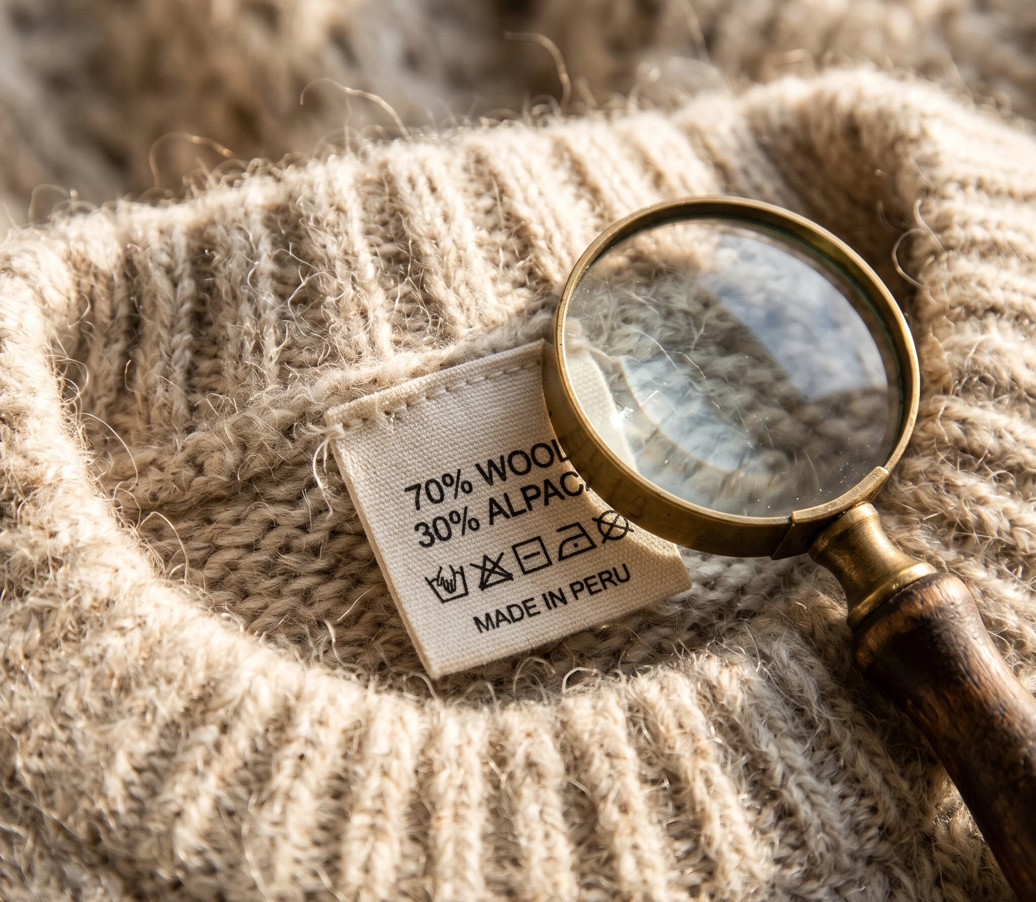
MANJEOBOM translates the fiber names and percentages on a clothing label into plain-language guidance. It brings together estimated feel, breathability and warmth tendencies, wrinkles, drying, static, stretch, care, and side-by-side material comparisons.
It does not claim that percentages can perfectly predict a finished garment. Two 100% cotton fabrics can feel completely different because of yarn, woven or knit construction, weight, density, brushing, or coating. That is why MANJEOBOM labels its results as estimates and points out what still needs a close-up photo, a specification, or the garment itself.
- Explain broad tendencies that fiber content and blend ratios may suggest.
- Highlight practical checks that product photos and short descriptions often leave out.
- Help shoppers judge fit for their own use and preferences instead of ranking fibers as universally good or bad.
A little less hesitation, and a little less regret
No tool can remove every surprise from online shopping. Color changes with lighting and screens, and the most reliable way to know a texture is still to touch the garment. But a clearer sense of what a blend may imply—and what remains uncertain—can make the decision easier.
I hope MANJEOBOM helps someone avoid one unnecessary return, or choose a garment that stays in the wardrobe for longer. After the photo catches your eye and before you press Buy, there is one useful question: ‘Will this garment really suit me?’ I want MANJEOBOM to make the answer a little more concrete.